




Dubai's Leading Digital Marketing Agency

AWARDS & RECOGNITION

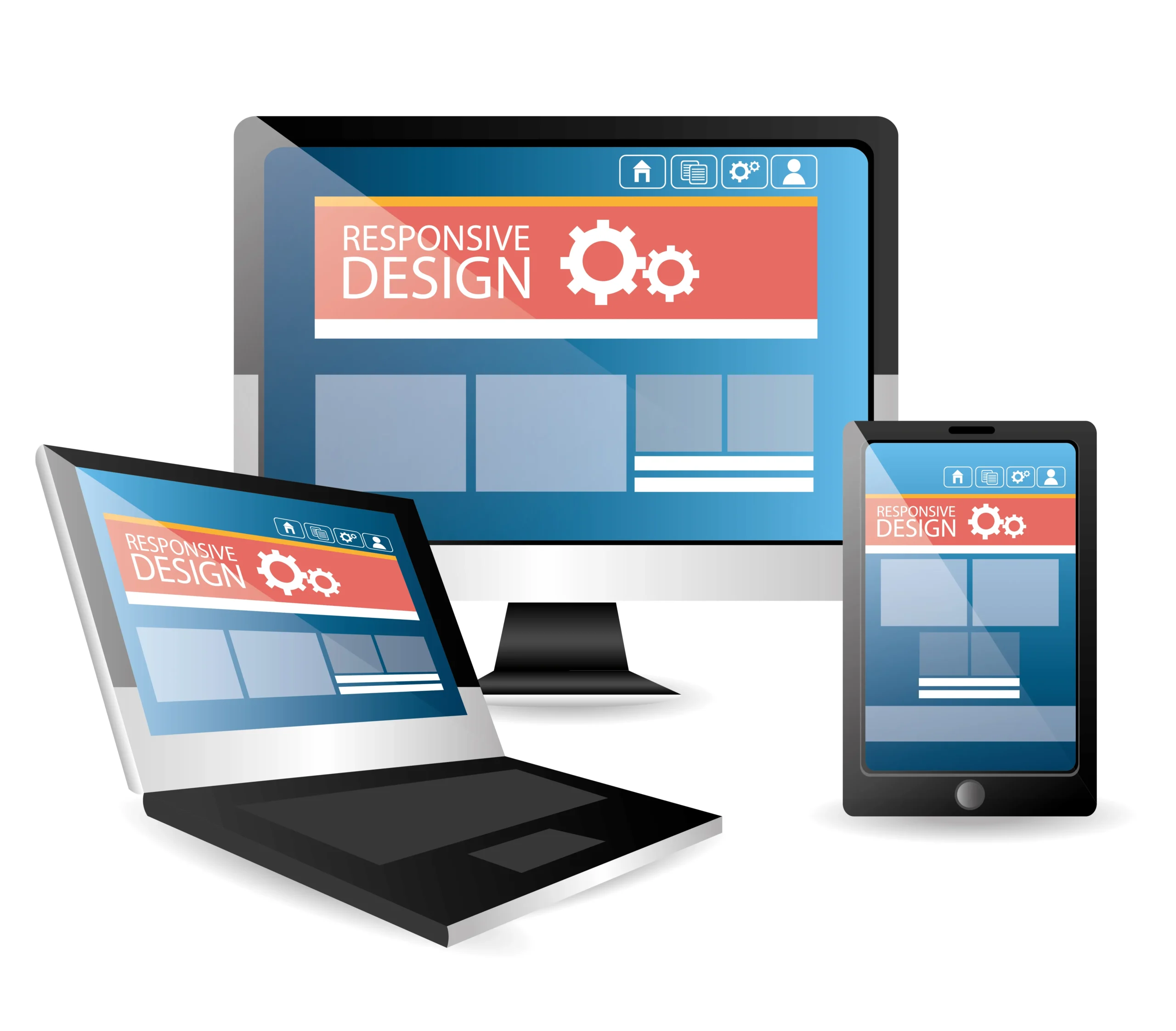
Responsive Design Is Not a Feature. It Is the Whole Experience.

Almost every website today technically works on a phone. The pages load and the content appears, but that does not always mean the experience works well. Small text, cramped buttons, difficult navigation, and awkward checkout flows can quickly frustrate mobile visitors.

The problem often starts when responsiveness is treated as something added after the desktop design is complete. Savit takes a mobile-first approach, designing around the smallest screen first and then expanding the experience for larger devices. This helps the layout, content, navigation, and interactions remain intentional across screen sizes.

For businesses in the UAE, where customers regularly browse, research, and enquire from mobile devices, that consistency matters. We build responsive websites for businesses across Dubai, Abu Dhabi, and the wider UAE, combining design, development, usability, and performance.

Best web design company in Dubai for responsive websites

The Numbers Behind Our Responsive Websites

100+

Team Members

400+

Active Clients

20+

Years Designing for Every Device

2,500+

Websites Designed

What a Screen-Ready Website Changes for Your Business

A responsive website does more than adapt to different screen sizes. It keeps your brand, user experience, speed, and visibility consistent across devices, giving every visitor a better path to engage with your business.

The Multi-Device Reality How Savit Handles It
Mobile is often the first interaction. Smaller screens make usability issues more noticeable, from cramped navigation to difficult-to-use forms. We design mobile-first, optimising layouts, navigation, tap targets, content hierarchy, and interactions for smartphone use before scaling to larger screens.
Your website shapes how people perceive your business. A poor mobile experience can make a strong brand feel less considered. Our responsive web design services keep the visual hierarchy, brand identity, and usability consistent across screen sizes.
Responsive design and performance need to work together. A site can adapt visually while still loading inefficiently on mobile. We consider asset sizes, code, images, and resource delivery as part of the responsive build rather than treating performance as an afterthought.
Mobile experience also affects search visibility. Google uses the mobile version of websites for indexing and ranking. We connect responsive development with SEO requirements so the mobile experience supports your wider search strategy.

73%

Visitors Leave Without Responsive Design

78%

Retail Traffic Comes from Mobile

20%

Average Conversion Lift from Responsiveness

Responsive Web Design Services Built Around Every Screen

A genuinely responsive website is the sum of several disciplines working together: mobile-first design, clean engineering, speed, and thorough testing. Our responsive web design services cover each of them, so your website performs consistently on every device your customers reach for.

Mobile-First Website Design

We design for the smallest screen first and scale the experience upward. This helps prioritise the content, navigation, and actions that matter most.

Responsive Website Redesign & Rebuild

If your existing website performs poorly on mobile, a redesign or structural rebuild can address the underlying problems while retaining the parts of your brand that already work.

Responsive Ecommerce Design

Ecommerce websites need to make browsing, product selection, and checkout easy on smaller screens. We design responsive stores around the complete mobile shopping journey.

Cross-Device UI/UX Design

Responsive design is also about how the interface feels to use. We adapt interactions, hierarchy, and navigation so the experience remains intuitive across devices.

Responsive Performance & Speed Engineering

A responsive website also needs to perform well in real-world conditions. We build with device-specific resource delivery, efficient code, and mobile performance in mind.

Responsive Testing & Quality Assurance

A website is not truly responsive until it has been tested across the devices and browsers relevant to its audience.

The Platforms Behind Our Responsive Builds

The right platform can make responsive performance easier to build and maintain. Savit works across established platforms and modern frameworks based on your website’s functionality, scale, and long-term requirements.

W

WordPress

Flexible for responsive corporate, service, and content-driven websites.

S

Shopify

Built for responsive ecommerce experiences with mobile shopping at the centre.

Magento

Suitable for larger ecommerce websites with complex functionality and requirements.

WOO

WooCommerce

Combines WordPress flexibility with a customisable responsive ecommerce experience.

Laravel & Custom Frameworks

For bespoke websites and web applications requiring tailored functionality.

React & Modern Front-End

For interactive, app-like responsive experiences with modern front-end requirements.

Give Your Customers a Better Experience on Every Screen

Bring your brand, UX, speed, and performance together in a responsive website built around how your customers browse.

How We Build Websites That Perform on Every Screen

A responsive website needs to be planned around different devices from the beginning. Our process starts with the audience and device requirements, then moves through design, development, testing, and ongoing optimisation.

Step 1: Discovery & Device Strategy

We understand your business, audience, existing website, and the devices customers use to reach you. For existing websites, we identify responsive and usability issues before design begins.

Step 2: Mobile-First Structure & Wireframes

We plan navigation, content hierarchy, and user journeys starting with the smallest screen, then expand the structure for larger devices.

Step 3: Responsive Interface Design

We design layouts, imagery, interactions, and intermediate breakpoints so the experience remains consistent across phones, tablets, desktops, and relevant screen sizes.

Step 4: Adaptive Development

Our developers turn the designs into clean, efficient code that adapts across screens, orientations, and browsers while supporting the required functionality.

Step 5: Multi-Device Testing

We test relevant devices, browsers, screen sizes, interactions, forms, readability, and performance before launch.

Step 6: Launch & Ongoing Optimisation

After a secure launch, we continue monitoring and improving the website as devices, browsers, technologies, and user behaviour evolve.

How We Build High-Performing Responsive Websites

Our responsive web design process ensures your website adapts smoothly to every device. From strategy and UX planning to development and optimisation, each step is crafted to deliver consistent performance and an engaging user experience. 

Our process begins with understanding your brand, goals, audience, and the devices your users rely on most. As a responsive web design company, we analyse how customers browse your website across mobile, tablet, and desktop to create a responsive strategy that supports smooth engagement everywhere. This stage includes reviewing your current website (if available), identifying performance gaps, defining essential features, and outlining expectations for design and responsiveness. We also develop a device-specific behaviour map to ensure layouts, menus, and interactions feel intuitive across all screen sizes. Clear planning ensures your future responsive website has the right foundation, structure, and purpose before any design work begins. 

In this stage, we create the blueprint for your responsive website’s structure and user journey. Our team develops wireframes that define how users will navigate, what paths they will follow, and how each screen will adapt responsively. As part of our responsive web development services, we focus on clarity, simplicity, and behaviour patterns that work across devices. We refine menu structures, content placement, visual hierarchy, and interaction flow to minimise friction and guide users smoothly toward their goals, whether browsing products, submitting a form, or reading information. By planning the UX framework early, we create a user-first structure that supports engagement and long-term performance. 

This phase brings your website’s visual identity to life. Our designers create mobile friendly website design interfaces that automatically adjust to different screens without losing aesthetics or functionality. Every layout, button, image, and visual component is designed with responsiveness in mind. As a trusted responsive web design company, we ensure your website maintains brand consistency while delivering smooth usability on all devices. We focus on touch-friendly elements for mobile, flexible grids for tablets, and clean spacing for desktops. The goal is to craft an interface that feels natural and visually impressive, encouraging users to stay longer and interact with your content. 

Once the design is approved, our developers transform it into a fully functional responsive website using clean, lightweight, and performance-focused code. We implement adaptive behaviours, ensuring your website adjusts fluidly to different resolutions, orientations, and browser environments. With strong responsive website development services, we integrate required tools such as forms, CMS features, ecommerce functionalities, APIs, and third-party systems. During this stage, we optimise speed, responsiveness, and accessibility, making sure your website functions equally well on fast networks, slower devices, and varying screen types. Our goal is to build a flexible, stable, and scalable website ready for real-world use. 

Before your website goes live, we conduct comprehensive testing across multiple devices, browsers, and screen sizes to ensure flawless behaviour. This includes mobile phones, tablets, laptops, high-resolution desktops, and different operating systems. As part of our responsive web development services, we inspect loading speed, responsiveness, image optimisation, interactive elements, navigation flow, and overall user experience. Every component is validated for clarity, touch interactions, readability, and performance. We fix inconsistencies, refine responsiveness, and ensure the website maintains visual accuracy across all devices. Rigorous testing guarantees that users experience a smooth, consistent, and reliable website, no matter how or where they access it. 

Once everything is finalised, your responsive website is deployed on a secure, stable hosting environment. Our team manages the technical setup, including DNS configuration, SSL activation, tracking scripts, and performance monitoring tools. After launch, we continue optimising loading speed, device compatibility, and SEO performance to ensure long-term stability. As an experienced responsive website development company, we provide ongoing support, updates, and improvements to keep your website aligned with evolving devices and user expectations. This continuous optimisation ensures your website remains modern, fast, and competitive, delivering the best possible experience across all screens. 

Why UAE Businesses Choose Savit for Responsive Web Design

Responsive design requires more than making a desktop layout fit a smaller screen. It involves design decisions, development, performance, testing, and ongoing optimisation working together.

Savit Approach Why It Matters Typical Alternative
01 Mobile-First from the Start
We plan the experience around smaller screens before expanding it to larger devices. Start with the desktop design and adapt the layout for mobile afterwards.
02 Design + Development Under One Team
UI/UX, responsive development, performance, and testing work together rather than being treated as separate stages. Design, development, testing, and optimisation handled as separate stages or by different teams.
03 Performance Considered During the Build
We consider assets, code, loading behaviour, and device conditions as part of the responsive experience. Performance issues identified after launch and addressed as separate technical fixes.
04 UAE-Focused Website Capabilities
Our responsive builds can support the requirements of businesses serving audiences across Dubai, Abu Dhabi, Sharjah, and the wider UAE. A generic website setup designed for a broad market without specific consideration of UAE requirements.
05 Support Beyond Launch
Responsive websites need to remain reliable as browsers, devices, content, and customer behaviour change. Launch the website and address responsive issues only when they are reported.

As a responsive web design agency with two decades of multi-device experience, Savit builds the site properly the first time, which is what makes it a genuine partner rather than a quick fix.

Give your users a seamless experience on every device with a fully responsive, mobile friendly website design

Our Clients

Packages

Enhance performance with mobile friendly website design packages for a seamless, adaptive experience across devices.
Map pin highlighting local SEO package services

Local SEO Package

Nationwide map showing national SEO package

National SEO Package

Online shopping cart for ecommerce SEO package

E-Commerce SEO Package

Client Review

Responsive Web Design FAQs

Contact us today to grow your business online!

Responsive web design makes a website adapt its layout, content, and functionality to different screen sizes, including phones, tablets, and desktops. It helps visitors navigate and interact with your website comfortably across devices. Savit builds responsive websites without requiring separate mobile and desktop versions.

A mobile-friendly website works on mobile devices, while a responsive website dynamically adapts its layout and interface to different screen sizes. Navigation, images, forms, spacing, and content can change based on the available screen space.

Yes. Savit can redesign or rebuild an existing website to improve mobile and cross-device performance. We review the current layout, navigation, content, and technical implementation before deciding whether targeted improvements or a broader rebuild is appropriate.

A responsive website can support search performance by providing a mobile-friendly experience and maintaining consistent content across devices. Google uses the mobile version of websites for indexing and ranking under mobile-first indexing. Responsive design can therefore form part of a broader SEO-ready website build.

Savit tests responsive websites across relevant browsers, screen sizes, and device conditions. Testing can include layouts, navigation, forms, touch interactions, operating systems, browser versions, and page performance, depending on the project requirements.

Yes. Responsive websites can be designed and tested across phones, tablets, desktops, and intermediate viewport sizes. This helps prevent navigation, grids, forms, and content from breaking between common screen widths.

A standard business website may take around three to six weeks, while larger ecommerce and custom projects can take longer. The timeline depends on the number of pages, functionality, integrations, content, revisions, and overall technical scope.

Responsive design itself does not necessarily slow a website down. Performance depends on factors such as images, code, scripts, hosting, and resource delivery. Savit considers responsive behaviour and performance together during the build.

Yes. Your existing logo, colours, typography, imagery, and visual identity can be retained while layouts, navigation, spacing, and interactions are adapted for different screens.

Yes. Savit provides responsive web design services across the UAE, including Dubai, Abu Dhabi, Sharjah, and the Northern Emirates. Services can cover new websites, redesigns, ecommerce platforms, and mobile optimisation based on the project scope.

Is your site struggling on mobile?

Tell us your challenges, and we’ll guide you with the right responsive fixes. 

Service Form

Blogs

WhatsApp

Wait! Don’t miss your chance to grow with us!

Service Form

Just one step away from scaling your business!

Talk to our Experts – no commitment needed
New Popup Form

We’re here to help
drop your details before you go!

Service Form